Por que SEO mobile virou assunto de receita, nao so de ranking
Hoje, em muitos projetos, o celular nao traz "uma parte" do trafego. Ele traz a maior parte. Quando a experiencia mobile vai mal, o estrago aparece em dois lugares ao mesmo tempo: a pagina perde forca no Google e o usuario desiste antes de virar lead, pedido ou cadastro.
Nao adianta a versao desktop estar bonita se a pagina no smartphone carrega devagar, corta conteudo importante, joga o CTA para baixo da dobra ou transforma um formulario simples numa tarefa irritante. O usuario nao vai ter paciencia. O algoritmo tambem nao.
Se voce quer descobrir onde isso esta acontecendo hoje, um bom ponto de partida e rodar uma analise no SEO Analyzer. Em poucos minutos ja da para ver se o maior gargalo esta em performance, renderizacao, meta tags ou usabilidade.
O que mobile-first indexing realmente muda
Quando o Google fala em mobile-first indexing, o recado pratico e bem direto: a referencia principal para entender e classificar sua pagina e a versao mobile.
Isso muda a forma de priorizar SEO:
- O conteudo essencial precisa estar disponivel no celular.
- Leitura, navegacao e toque precisam funcionar sem esforco.
- Velocidade e estabilidade visual importam ainda mais.
- Sitemap, canonical, robots e dados estruturados nao podem quebrar na experiencia mobile.
Muita empresa ainda trata o mobile como adaptacao de ultima hora. E exatamente ai que o site comeca a perder terreno.
O basico bem feito: uma estrutura realmente mobile-friendly
Responsivo continua sendo o caminho mais seguro
Manter versoes separadas como m.seudominio.com costuma gerar retrabalho, inconsistencias e mais chances de erro tecnico. Na maioria dos casos, um layout responsivo bem pensado resolve melhor.
Vale prestar atencao nestes pontos:
- use unidades relativas como
%,remeem - trabalhe com poucos breakpoints, mas bons
- trate os alvos de toque como itens criticos
- deixe espaco entre botoes, links e filtros
1/* Prioridade para o mobile */
2.container {
3  width: 100%;
4  padding: 1rem;
5}
6
7.cta-button {
8  min-height: 48px;
9  padding: 0.75rem 1rem;
10}
11
12@media (min-width: 768px) {
13  .container {
14    max-width: 960px;
15    margin: 0 auto;
16    padding: 1.5rem;
17  }
18}
E nao deixe passar o viewport:
1<meta name="viewport" content="width=device-width, initial-scale=1.0">
Teste paginas que realmente movem o negocio
Avaliar so a home e pouco. O que costuma decidir a experiencia mobile sao outras URLs:
- artigos com trafego organico
- paginas de produto ou servico
- categorias
- paginas de captura
- formulario e checkout
Uma rotina boa costuma juntar:
- SEO Analyzer para um diagnostico rapido
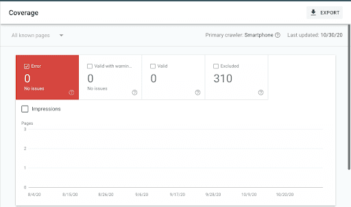
- Google Search Console para indexacao e Core Web Vitals
- Lighthouse para medir renderizacao e peso
- Mobile Viewport Tag Generator quando o problema esta no enquadramento da tela
Erros que continuam derrubando site no celular
Alguns problemas aparecem o tempo todo:
- pop-up que cobre o conteudo
- fonte pequena demais
- botoes colados uns nos outros
- imagens e tabelas que estouram a largura
- formulario longo e cansativo
- scripts de terceiros atrasando tudo
A regra e simples: se a navegacao no celular parece trabalhosa, o SEO tambem vai sentir.
Velocidade mobile nao e perfumaria
As metricas que merecem sua atencao
Em vez de olhar so "tempo total", monitore o que de fato descreve a experiencia:
- LCP para entender quando o conteudo principal aparece
- INP para medir resposta a interacao
- CLS para ver se a tela fica pulando
- TTFB para checar o atraso do servidor
Em mobile, basta um banner pesado, um menu mal implementado ou um bloco de anuncio sem dimensao para a experiencia ficar irritante.
Imagem boa e imagem bem servida
Em muita pagina, o maior inimigo da performance mobile esta nas imagens.
O que ajuda de verdade:
- usar WebP ou AVIF
- gerar tamanhos diferentes
- definir largura e altura
- aplicar
loading="lazy"quando a imagem nao for critica
1<picture>
2  <source
3    srcset="image-400.webp 400w, image-800.webp 800w, image-1200.webp 1200w"
4    sizes="(max-width: 600px) 400px, (max-width: 1200px) 800px, 1200px"
5    type="image/webp"
6  >
7  <source
8    srcset="image-400.jpg 400w, image-800.jpg 800w, image-1200.jpg 1200w"
9    sizes="(max-width: 600px) 400px, (max-width: 1200px) 800px, 1200px"
10    type="image/jpeg"
11  >
12  <img
13    src="image-800.jpg"
14    loading="lazy"
15    width="800"
16    height="600"
17    alt="Imagem otimizada para uma pagina mobile"
18  >
19</picture>
Infraestrutura, cache e scripts tambem contam
Nem todo problema mobile esta no front-end. Vale revisar tambem:
- CDN
- cache de navegador e borda
- corte de scripts de terceiros
- CSS e JS minificados
- carregamento adiado do que nao e critico
Na parte de publicacao e sinal tecnico, Meta Tag Generator, Schema.org Generator e Sitemap Generator ajudam a nao deixar pontas soltas.
Conteudo para quem esta lendo no celular
Escreva para leitura em movimento
No smartphone, a leitura costuma ser mais picada. A pessoa bate o olho, procura resposta, decide se vale continuar.
Por isso funciona melhor quando o texto:
- responde cedo
- usa paragrafos mais curtos
- tem subtitulos honestos
- usa listas quando elas realmente facilitam
- destaca so o essencial
Nao e sobre simplificar demais. E sobre tirar atrito.
Entenda a intencao de busca mobile
As buscas feitas no celular costumam ter mais urgencia e contexto:
- "como melhorar seo mobile"
- "site lento no celular"
- "core web vitals ruim no ecommerce"
- "agencia seo perto de mim"
- "teste de site responsivo"
Tambem entram mais buscas locais, buscas por voz e consultas de quem quer resolver algo rapido.
Dados estruturados podem puxar mais clique
Na SERP mobile, o espaco e disputado. Qualquer elemento extra que ajude seu resultado a ficar mais claro pode melhorar CTR.
Os formatos que mais aparecem nesse tipo de pagina:
ArticleFAQPageHowToProductLocalBusiness
Se isso ainda nao esta bem implementado, vale usar o Schema.org Generator.
UX mobile que ajuda SEO e conversao ao mesmo tempo
Navegacao que nao faz o usuario pensar demais
Menu mobile bom e menu obvio.
O que tende a funcionar:
- poucas opcoes principais
- busca visivel em sites com muito conteudo
- CTA principal facil de achar
- poucos niveis de submenu
- filtros que nao sequestram a tela inteira
Formularios, cadastro e checkout
Aqui se perde muita conversao sem necessidade.
Cheque o seguinte:
- menor numero de campos possivel
- teclado certo para cada entrada
- autocomplete ativado
- mensagem de erro clara
- botao grande o bastante
- passos visiveis em fluxos maiores
No celular, cada campo extra pesa.
Checklist tecnico antes de publicar
robots.txtsem bloqueio acidental- sitemap atualizado
- canonical coerente
- nenhum
noindexperdido - redirecionamentos 301 funcionando
- testes reais em mais de um navegador e tamanho de tela
1<link rel="canonical" href="https://www.example.com/your-page-url">
Como medir se o mobile SEO melhorou mesmo
KPIs que valem acompanhar
Nao precisa virar refem de um painel gigante. Comece com:
- trafego organico mobile
- taxa de conversao mobile
- CTR no mobile
- LCP, INP e CLS nas paginas prioritarias
- posicao das keywords no celular
- erros de cobertura e indexacao
Se uma melhoria tecnica nao mexe em nenhum desses sinais, talvez ela nao tenha atacado o problema principal.
Trabalhe em ciclos curtos
Uma rotina madura costuma seguir esta ordem:
- identificar o gargalo
- priorizar pelo impacto no negocio
- corrigir uma causa especifica
- medir o efeito
- repetir
SEO mobile melhora mais com consistencia do que com um grande mutirao de uma vez so.
Perguntas frequentes sobre SEO mobile
So deixar o site responsivo resolve
Nao. Responsivo e o minimo. Voce ainda precisa de velocidade, conteudo bom, links internos bem pensados e boa experiencia de uso.
Quanto tempo demora para aparecer resultado
Melhorias de UX e conversao podem ser percebidas rapido. Ajustes de indexacao, rastreamento e ranking costumam levar algumas semanas.
Blog tambem precisa passar por Core Web Vitals
Precisa. Artigo lento, instavel ou ruim de navegar no celular perde leitura e tende a render menos organicamente.
Qual pagina otimizar primeiro
A URL que mais recebe trafego mobile ou gera mais receita. Normalmente e ali que o ganho aparece primeiro.
Fechar a lacuna mobile custa menos do que continuar adiando
Muita empresa nao perde busca porque escreve mal. Perde porque, no celular, a pagina pede esforco demais em cada etapa.
Se a meta e melhorar visibilidade, cliques e conversao, siga um caminho direto: audite com SEO Analyzer, ajuste os sinais com Meta Tag Generator, revise o markup com Schema.org Generator e acompanhe os indicadores certos. Quando a experiencia mobile fica leve e previsivel, o SEO costuma responder junto.